The
most recently released of the film posters I have analysed, 'Far From
The Madding Crowd' takes a very minimal approach compared to other
contemporary film posters. Just because it is minimal though, does
not mean that it is interesting or successful in getting people to
see the film.
The
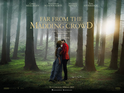
striking thing about this poster is the fact that it is composed on a
single image that exaggerates the natural setting of the rural film.
It is mainly striking because the image has been edited in a way that
is rather muted due to the fog whilst using the couple kissing as a
central thing to look at. Interestingly, the figures almost merge
into the background and fit seamlessly into it.
However,
they also stand out because the colours red and blue are distinctly
different from the greens and browns behind. Most effective is the
fact that the pose of the couple implies heavily that they are having
a romantic entanglement. This combined with their background is
connotative of secret relations because their location is isolated
and alone.
The
placing of the title directly above the kissing couple means the
entire poster feels centrally aligned which fits into the
middle-third and feels visually pleasing. This is exaggerated by the
fact that most of the text, apart from print at the top and bottom,
is in the centre either above or below the couple
The
font used throughout is also effectively grand, traditional and
in-keeping with the sense the period drama needs. By using a font
similar to 'Time New Roman', the poster creates a sense of heritage,
it is after all based on Thomas Hardy's novel of the same name. I
also like the way that the logo to the film plays around with the
size of the letters and formulation of the words whilst remaining
understated and classy.
It
is important for film posters to have the names of its stars on it,
in order to sell the film. Like most things in the period drama, even
the actors names feel understated because of how high up and small
they feel. Even though the names technically break the using of the
middle third, the names are still centrally aligned and equally
separated to give the looker time to process them.
Overall,
the poster conveys everything it should. It conveys that this is a
love story, that this is a period drama and that this will be
traditional. In my opinion, this is mainly because of its minimality
and its elegant placing of words on top of a simple yet complex
striking image.

No comments:
Post a Comment