Tuesday, 29 September 2015

3 Double Page Spread Drafts

1


2

3


Many film magazines follow the same format as any other type of magazine with tendencies like Headlines, stand firsts and drop caps. Therefore, I decided to use the knowledge I developed last year when making a music magazine to inform my drafting process.

Option 1 is possibly my favourite as it involves having the whole background as an image which is a very immersive way to present a review. It is also fitting with my genre which is occasionally decadent whilst being immersive and beautiful. Therefore, if when shooting on location I take a strong image of my cast this kind of layout lends itself to such imagery.

Option 2 is perhaps more conventional for a film review because of the layout and the spacing. It also has two images from the film instead of one which means a potential audience member can see more of the work and thus is more likely to be attracted to seeing it. There is also more room for text within this layout which means more content can be placed on the page and, usually, the more information about a film the better. The room for pull quotes and larger sections of texts are also a good way to grab a glancing reader’s attention if an interesting statement is placed.

Option 3 feels more basic than the other layouts but this is not necessarily a bad thing. This is a good possible layout as it is clear and to the point. It equally allows the reader to be attracted by an image as it does to be attracted by a pull quote or interesting headline. 

3 Film Poster Drafts


1


2


3


After studying other film posters of my genre, I was inspired that my poster should be in a rural setting as my entire short film is set outside. I will also have my actors in the clothes used in filming due to continuity reasons. It is most likely that I will shoot the image used on my poster on location alongside my film to make sure they look the same but also to ensure the backgrounds are the same.

All drafts, in my opinion, will be equally as fitting for my genre and short film as the other. However, I particularly like the layout of Option 1 as I feel it conveys the dynamics of my characters relations very well and would entice a possible audience member to find out more. I also like Option 1 because, if well edited, it will be aesthetically pleasing with bright dark browns and greens to contrast my actors clothing

Option 2 would be equally as aesthetically pleasing due to the use of dramatic silhouettes and nature surrounding them. Also, as they are all walking in the same direction, there is a sense of mystery and wonder as to where they are going. If I do go with this layout, I will ensure that my female protagonist is leading the men to show that she is the leader and cause of the drama within the piece.


Option 3 is possibly my least favourite as it seems, to me, as if the characters are too static and separate. Bearing in mind that the period drama is about deep character relations, this kind of poster feels false and too far away from my genre’s tendencies. 

Monday, 28 September 2015

Costume Development


In theory

Whilst I was writing my script, I found myself thinking about how my characters would look. I imagined:

- Charlotte in a larger dress, with bright colours such as red or blue, to show that she is a wealthy woman and wears what many woman of her status (upper class) would have worn within the period. I did consider her to have worn veils and gloves but I think she is too honest for such add-ons. I also think she would have a favourite dress and tries to remain simple.

- Tess in a muted coloured dress (beiges and creams) as she is not the main character and is slightly below Charlotte in terms of wealth. I also imagine her dress to be more slim and less large or full as Charlottes.

- Johnson in formal wear yet, seemingly, casual. This means no tailcoat or jacket – just a waistcoat and shirt to show that he is slightly unhinged (especially in the final scene). To be contextually relevant, though, I will have him wearing a cravat instead of a tie.

- James should have two different outfits. For Butler, he should be in a white shirt and black bow tie as this is the wear of an archetypal butler and the audience will get it immediately. For James, I would like him in a beige top and trousers to imply a sense of simplicity and austerity.


In practice:

In terms of my male characters, I had no problem sourcing their costumes as I simply found items of mine or friends clothing that fit the specification (such as 100% cotton shirts), so my male characters ending up looking how I described above (or close enough to).

As I do not have a costume budget, I went into my schools Drama departments stock to see what type of dresses I had to work with for the girl characters. These were my top selections:


It seemed instantly obvious to me that this dress (on the right - red and green) was the perfect dress for Charlotte to wear as it felt opulent yet humble enough for her to wear. I also felt that the dress was innocent, due to the floral pattern, yet strong due to the green paneling over the top. 


For Tess, though, I had more options: 


1234


As I wanted Tess to less opulent than Charlotte, and more hard working, I found that all of these options would be wearable. However, I very quickly discarded 1 and 2 as they were not complete dresses and were either broken or too short for the era. I also discarded 3 quickly as I felt it was rather peasant girl, and the early 18th Century didn't have many peasants and even the servants wore cleaner outfits with more detail. Eventually, I chose the beige patterned one (the one on the left) as I felt it was the most in keeping with my eras and characters modest tendencies. It was also not as colourful as 4, which means the dress isn't going to distract the viewer from the more important dress - Charlottes. 

I also found these two  black capes and covers: 


As I will be shooting outside, these capes will add to the effect of my characters being cared for and rural. The longer black cape would also be effective for Charlotte to wear when adventuring into the woods as it implies a sense of secrecy and mystery. She is, after all, committing a very serious crime within the period. 

Contextual Thoughts


Recently I have become increasingly aware that to create a successful period drama, you must be aware of the time-frame of which you are telling your story in. Of course, to carry out a comprehensive study of the period would be impossible due to time constraints. Therefore, I shall use the knowledge I already have alongside some base research in order to make a product that is professional and in-keeping with professional competitors and conventions.

I have chosen the late 18th and early 19th Century as a setting. This will influence my piece in these main ways:

- Most glaringly obvious are the choices surrounding costume. Of course, I do not have the budget to go extravagant with my costumes. I just need to make sure that the choices I do make are coherent. There will be a separate post about costume as I feel it is quite an extensive discussion and will overflow this post.

- In this time period, there was a growing number of Romantic writers, like Blake, and realist writers, like Austin. This means that language was savoured and was delicately chosen by the educated. This is why the gaps between the classes was so evident – because of the gaps in education. For example, Bronte in 'Wuthering Heights' purposely writes the servants dialogue, Joseph, in a riddling unreadable way to exaggerate the effects of the class system. In short – how one character speaks should imply their status and their education. This means that much care should be taken during the script writing process but also during the rehearsal with actors to make sure that the viewer can understand the characters as quickly as possible.

- As I, sadly, do not have the facilities or the budget to film at an old manor house or a stately home – I have decided to film in natural settings as many of the period dramas I have analysed are inspired by the pastoral and the rural. Bearing in mind that many people spent time outside within this era in order to play and to entertain themselves.This does arise problems, though, as I will be filming in changing seasons therefore my script and planning must compensate for this, to ensure that there are no continuity problems. The locations must also feel authentic (with no signs of the modern world) and isolated – so I am currently thinking that a woodlands or forest would be best for the bulk of filming.  

Script - In the Woods


Tuesday, 22 September 2015

Spider Diagram of Plot Ideas

In order to be ensure clarity within my work and process, I first made a list of my top 5 plot ideas; 


After considering all these 5, I then decided to develop and draw out the top 3 ideas that I preferred; 


1

24


I then began to talk some of my peers and teachers through the 3 ideas to see what would work best within the short film period drama genre. I decided that Plot Idea 1 (A Woman has 2 lovers) worked the best in terms of levels of drama and narrative within 5 minutes. It also brought up themes of Class Division and Romance (which were preferred in my survey) as well as having pastoral elements and a definite ending

I then began to develop my script and advance towards production. 

Sunday, 20 September 2015

Camera Workshop

As part of my process, I partook in a camera workshop to ensure I was cinematically ready for filming and to ensure I was prepared for the problems that may arise when filming. The things I learnt were:

● Be aware of principle shots and have a detailed shot list. Improvisation on a set isn’t always productive.

● Try to avoid taking shots without a tripod unless I want a handheld or POV feel (which I most likely will not as this is not conventional for my genre).

● Leave around 3 seconds before and after a take in order to allow myself editing time.

● When composing / placing a shot make sure that I keep to the rule of thirds in order to make an aesthetically pleasing shot. Also, make sure that there is headroom within a shot as cutting off the top of an actors head looks unprofessional.

● When filming a tracking shot use a dolly cam (if the terrain allows it) and make sure you leave walking room within a shot in the direction the actor is walking.

● There is a big difference between zooming and progressively moving with the camera. To dolly the shot looks more professional as it gives the shot more depth of field as more is changing in the visions of the viewer.

● When getting into a performance space, spend the time to do detailed blocking and rehearsal with your actors to ensure the shots you create are professional and usable.

● Film a conversation / scene at least 3 times from different angles. As my films is dialogue based and is a period drama, I will need to film many different angles (especially since each scene has a minimal of 3 people).

● Never cross a line of actions. Meaning that all drama should be shot from the same side as it means it will always have the same background.

● Be aware of the importance of continuity. Take pictures of the set and actors in detail in case re-shoots have to take place and the shots used in the final take feel natural and in the same time frame.

● When framing, ensure that the light does not limit the depth of field (unless this is what is desired). Light is important as it, essentially, effect mise-en-scene but also the aesthetic of your shots.


● In terms of camera positioning and movement there is a lot to consider. The main points being that all shots shot be considered, from low angle to high angle, from static to shaky. They all convey something and it is my job as director to ensure these shots are thought out deeply and properly. 

Saturday, 12 September 2015

Discussion of Survey Monkey Results

A summary of my results:


How do you think context is best established in a Period Drama?
It is best to establish context of the piece through accurate overall Mise-En-Scene and Costume. Setting is of course still important as 37.5% of my audience chose this. I find it interesting that 0% of the responses chose dialogue as a key factor of establishing a time zone. This response I will have to take with a pinch of salt as the Period Drama as a genre needs dialogue, but I will take into account that I should perhaps focus on other elements more than dialogue.


What type of camera shots would you associate most with the Period Drama?
My response shows, relatively conclusively, that the Two-shot is most important for the viewer when watching a successful Period Drama. Interestingly, Establishing shots and Long shots were also regarded as important (which they are). Therefore, I will focus on these two types of shots when composing my piece.


What kind of setting would you prefer in a Period Drama?
As I made this question have a written response, I have allowed my viewer more of a say in terms of what they want. Many responses refer to a manor house or an older house. Due to budget limitations, I may not be able to find such a location. However, I found these responses insightful:

"One main setting which is symbolic of the theme being portrayed"

"A Wood or Forest"

"An extravagant garden"

If I was to combine these responses, I’d come to the conclusion that if I chose an outdoors setting that is applicable to my time frame, alongside an appropriate narrative, this kind of setting could become symbolic to the mise-en-scene of my film.


Select a theme you feel is most important in a short film:
Interestingly, ‘Class Divisions’ as a theme received a very high vote with Romance appearing to be the second most popular. In aspect of the pieces I have studied, Class Division plays a big part of the genres definition alongside an important romantic element. Therefore, my film will try to use nuances of both themes within my script.


Would you prefer characters to speak with regional accents?
Before discussing the results to this question, I should probably explain why I’ve asked this question. In the short films ‘Lacey’ and ‘Mesmerize Me’, I found that the two protagonists were most relatable and likable due to their thick character accents that gave the script more authenticity and depth of character. So I asked this question to see if an audience also had the same feelings in response to regional accents and with ‘Yes’ receiving 87.5% of the vote, I think it is obvious that this is very much the case.
Therefore, when writing my script and preparing my actors I should make this a defining feature.


What kind of music would you expect to be used in a Period Drama?
Out of all of my questions, I found that this question received the most varied feedback in terms of numbers. Equally, both a piano-based score and no score at all (which allows a focus on dialogue) were voted for. Consequently, I will use a mixture of both techniques (like many conventional Period Drama’s) that uses a piano soundtrack that cuts off during a vital moments of conversation. This should be done subtly so that the viewer is not too-aware of this transition of the audible.


Do you think a romantic implication is need in a Period Drama?
They voted ‘Yes’. This means that when composing my script and line of narrative, I’m going to ensure that there will be a romantic implication.


How would you prefer a short film to end?
Interestingly, the responses, almost unanimously, state a preference for a ‘definite ending’ with a ‘resolution’. Considering that my film will only be around 5 minutes, a certain ending would perhaps prove challenging. However, I do agree with the notion that a Period Drama short film should end on a ‘neat and tidy’ basis where the audience feels that issues have been resolved.


What is your overall aim when watching a Period Drama?

I asked this question mainly due to curiosity but also because the responses will give an important insight into what the consumer actually wants. Many viewers refer to escaping or learning about time zones/periods whilst other viewers refer to connecting with characters or to be nosey. In a sense, this is exactly what I want. I want viewers to be transported to a different time and to, essentially, get them to emotionally invest into my characters. This, of course, doesn’t go without its challenges but I am hoping that with a good script and production – I can achieve this aim successfully.  

Responses to Survey Monkey

Survey Monkey Questionnaire

Create your own user feedback survey

Double Page Spread Analysis Conclusion - Conventions


This is my summary of points and conventions about what my double page spread should include:

- The image must be striking and should lead the desire of the article.

- The image should convey the mise-en-scene or general themes of my film because that is what holds the double page spread together and, more importantly, is what could cause potential audience members to go and see the film.

- The magazines article merges to the films brand and not the other way around. Therefore, brand synergy and house style is paramount when developing my double page spread for my short film.

- The typography I use should be, mainly, conventional and readable in order to not upstage any other qualities of my double page spread. 

Double Page Spread Analysis - The Peanuts Movie


As this particular double page spread is from an in-house magazine and is of an animation film I have decided to not analyse it in full, but to comment on particular important observations as I think there are several key choices that will influence my product positively:

- Apart from the feature article photograph, there are only 3 select colours used in the spread which gives it a professional and coherent feel.

- As with the case of my other two examples, the magazine should manipulate it’s house style according to the product they are selling (the film) which means that, technically speaking, the film makers genre and wishes should dictate the entire spread.

- In similarity to Bond, the article has a headline that isn’t the film’s title as this is advertising a well-known franchise and brand.


- The picture looks staged, or purposely created, which means that the viewer is left yearning for further stills from the film. Also, it is well communicated that the main character is facing the camera, or reader, because this means that we can instantly relate with him the quickest and easiest. 

Double Page Spread Analysis - Gods and Monsters


- In similarity to the Bond double page spread, the first thing the eye is drawn to it the feature article photograph. Most dominant within the photograph is, once again, the stories protagonist which indicates to the reader several things; he is alone in his quest, he is a strong warrior and the story/film is about him. The mise-en-scene of the image is that of a stereotypically masculine, with all the smoke and browny earthy colours. The reason I chose this double page spread is because the image communicates something that I will need to use in my ancillary task: that this is a period piece. Of course, it is not a romance but from the costume and smaller image, we know that this is set in an older period.

- The layout of the article is an interesting, interactive and new-take on the medium. The placing of the headline over two the two pages causes an integration of text and image that feels seamless and successful. Furthermore, the placing of the second smaller image gives the article an off-centre feel which shows that the film is not a traditionally structured, coherent one. Also, the second image does not demand the attention that the headline, stand first and feature article photograph demand as it has a much more muted colour palette with no direct-looking at the camera. Plus because of the size of the second image, there is more image than text which makes the double page spread feel more aesthetically lead and that the text comes second which would makes sense because this is, after all, selling a film.

- The typography is also effective because of the readable, traditional text that also includes enough variation of colour and size for it to have enough change and contrast. The two relatively small columns with sizeable text caters to an audience that may not want to read too-much of an article, as it is leisurely, therefore the two small columns deal with this issue. And the typography used within these columns is readable, clear, subtle yet seeming quite dramatic due to the boldness of the letters but also because of the extended nature of certain letters. 

Double Page Spread Analysis - Skyfall


- The first and most dominant thing about this double page spread, is the strength and beauty of the feature article photograph. It is interesting how the text image manage to work in synergy with each other with extraordinary effect. The reason the image works and is pleasing to the reader is because it plays with levels, perspective and the depth of field. By having three different depths (the actor, the car and the background) to the image means that the viewers have a clear sense of the hierarchy of importance. Not to mention the use of the rule of thirds makes the photo pleasing, further. Most importantly, with all this aside, is the fact that the image communicates the films essence extremely well. Bonds body language of confidence and elegance, in combination to the presence of a luxury car in a context of desolation and industrialism, means that the reader is instantly gaining a sense that the film will be a spy thriller that is gritty yet opulent at the same time.

- The layout of the article works as the text and image seem to work together and not in separation. Placing the text far enough away from the actor means that the viewer can understand that the character, Bond, is isolated. Furthermore, by placing the text just above the car gives the second page (the right hand side of the whole image) a feel of being systematically halved. This also makes the article feel less affronting or 'chunky'. The layout of the article itself is also effective because of the dominance of the articles headline. As Bond is a well-known franchise, the magazine can get away with placing the films title in a relatively small box, whilst making the headline about the films themes rather than the film itself. The way that the article itself and the articles tag line fit under the headline in three nice columns is also pleasing due to a continued theme of thirds.

- The typography also fits the brand incredibly well due to its clear, dark, bold nature. Seemingly, the magazines house style and bigger branding amalgamates itself with the branding of the film it is covering when creating the double page spread. This is a key move in creating a professional product as it means the reader, and potential audience member to the film, have a real chance to digest the film without watching a trailer or seeing the poster to it. Therefore, the overall mise-en-scene of the article is crucial. 

Friday, 11 September 2015

Poster Analysis Conclusion - Conventions


- The images are very important when creating a sense of branding and creating a positive initial impression with potential audience members. This means that the images should be striking, have a sense of narrative and have costumes in them.

- The font should be a readable, traditional font that conveys a sense of heritage and strong story-telling.

- The font should be placed in parts that may have negative space.

- The poster should have the small print at the bottom or top as it feels professional and fills space that would be otherwise unused.

- The colours, in general, should not be too gaudy or demanding. 

Poster Analysis - Pride and Prejudice


This poster, once again, uses yet changes conventions. Most film posters either use one strong image or merge many film stills together in order to make a strong poster but this poster uses two separate images collaboratively to create a strong poster.

The image of the stories two protagonists is definitely, for me, the aspect of this poster that sells the film the most. The framing of the image uses the depth of field to create a sense of drama and importance in these two characters because the female lead is larger and looking tranquil whilst notorious Mr Darcy is approaching, looking stern and occupied. The reason that the image below works coherently with the one above is because both are using only sunlight and have the same tan pallet which makes them feel like they're taken at the same time of day.

It also feels important that the images are broken up by the text instead of the text working on top of the images. Like the other two film posters, it uses a traditional, easy-to-read font to convey it's necessary sense of timelessness and romance. In fact, the logo doesn't so much look like a logo as much as just two words typed together which works because of how understated and notorious the story is. Once again, heritage of the stories are a selling point. The names of the actors are equally understated and, seemingly, unimportant to the overall impression of the film and its poster.

The film uses the conventional small print that gives out important information about the films production such as the director, producers and script writers. However, in scale to the images and other texts it feels slightly smaller than usual and slightly unreadable. To a certain extent, though, it isn't so much the point to read this section of the poster – it is more the fact that it is just there.


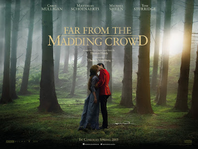
Poster Analysis - Far From the Madding Crowd (2015)


The most recently released of the film posters I have analysed, 'Far From The Madding Crowd' takes a very minimal approach compared to other contemporary film posters. Just because it is minimal though, does not mean that it is interesting or successful in getting people to see the film.

The striking thing about this poster is the fact that it is composed on a single image that exaggerates the natural setting of the rural film. It is mainly striking because the image has been edited in a way that is rather muted due to the fog whilst using the couple kissing as a central thing to look at. Interestingly, the figures almost merge into the background and fit seamlessly into it.

However, they also stand out because the colours red and blue are distinctly different from the greens and browns behind. Most effective is the fact that the pose of the couple implies heavily that they are having a romantic entanglement. This combined with their background is connotative of secret relations because their location is isolated and alone.
The placing of the title directly above the kissing couple means the entire poster feels centrally aligned which fits into the middle-third and feels visually pleasing. This is exaggerated by the fact that most of the text, apart from print at the top and bottom, is in the centre either above or below the couple

The font used throughout is also effectively grand, traditional and in-keeping with the sense the period drama needs. By using a font similar to 'Time New Roman', the poster creates a sense of heritage, it is after all based on Thomas Hardy's novel of the same name. I also like the way that the logo to the film plays around with the size of the letters and formulation of the words whilst remaining understated and classy.

It is important for film posters to have the names of its stars on it, in order to sell the film. Like most things in the period drama, even the actors names feel understated because of how high up and small they feel. Even though the names technically break the using of the middle third, the names are still centrally aligned and equally separated to give the looker time to process them.

Overall, the poster conveys everything it should. It conveys that this is a love story, that this is a period drama and that this will be traditional. In my opinion, this is mainly because of its minimality and its elegant placing of words on top of a simple yet complex striking image. 

Poster Analysis - Anna Karenina (2012)


Interestingly, this is possibly the most detailed and cluttered period drama film poster I have, personally, ever seen. The poster could feel cluttered or 'busy' due to the fact that it is built up of many layers that mix characters with texts and backgrounds. The content does do what every poster should do, though. It gives us a serious sense of narrative, context and character relations. To expand:

- The main background with it's dark colours, smoke and buildings have a connotative sense of opulence, due to the chandelier, but also an industrial sense because of the silhouettes of horses and trains. Subtly, Russia's famous building the Kremlin has been used on the left side in order to imply the films context – Imperial Russia. This background, then, whilst seen alongside the main characters costumes certainly confirms to the prospective viewer that this film is about aristocratic relations in a, now, historic setting.

- The proxemics of the characters are also key to the success of this poster in relating to viewers that this is a period drama and, perhaps most importantly, a romantic one. The fact that the films main lovers have been placed centrally in a, rather, dramatic position of lust and longing confirms thar this story will be about two characters falling in love. The lone presence of an older male to the left of this couple also implies that there is going to be some conflict involving him as he is smaller and angled at a way that conveys hostility and presentation.

- Most subtle, though, is the fact that the lower poster is trimmed with footlights and a theatre-like border. Historically, Imperial Russia is known to have been an artistic flourishing time for both literature and theatre due to pioneers like Tolstoy, the writer of Anna Karenina. This influences the way that the film was filmed as director Joe Wright uses a post-realist perspective that uses the sets of a stage to navigate the story. Due to this, the bottom-border is a preview to prospective viewers how the film is cinematographically composed and of its larger themes.

In my opinion, though, the most effective part of this poster, apart from impressive composition and implicative choices, is the text. First of all, the typography is clear, concise and readable. As the poster is already quite 'busy', the text is not over-the-top or too complicated in order to not confuse the viewer. Furthermore, the text is conservatively bold and flat which means it jumps out of the page and is followable.

A way that this poster challenges convention is the way that the posters small print is not placed at the bottom, instead it is placed just below the films title. It does, however, follow convention because it follows the classic layout of making the names of production companies and the people involved larger than their titles. This makes the poster look professional and integral. However, over all I think the poster is slightly too-much because of how many visual things there are and I believe it should be stripped down more, like other period drama posters.  

Saturday, 5 September 2015

Short Film Analysis Conclusion - Conventions


At first glance, it could be considered that the period drama and the short film are at conflict. This is because traditional love stories that period dramas explore seem to demand strong character establishment, a longer plot that allows the viewer to go on a journey that finishes and the promise of being transported back in time. Whilst the short film seems to use less established characters, less conclusive plots in situations that can be deemed as 'relatable'. However, the period drama short films I have studied have showed me that it can be done very well if:

- Establish characters subtly yet firmly. This means your characters should be archetypal, IE a married woman, a dominant male, a maid, a servant, a vicar.

- Settings should be gripping and interestingly shot.

- A good variation of scenes that are of a good length, in order to allow the drama to develop properly.

- Dialogue should be clear and should add to the drama within the piece whilst implying to a larger diegesis.

- Short films should stick to a simple formula, where one dramatic event is solved throughout.

- Instead of connecting to many characters on screen, like during a feature length period drama, you should attempt to have the viewers connect to only one character – your protagonists.