1

2

3

4
5

6

7

8

9

10

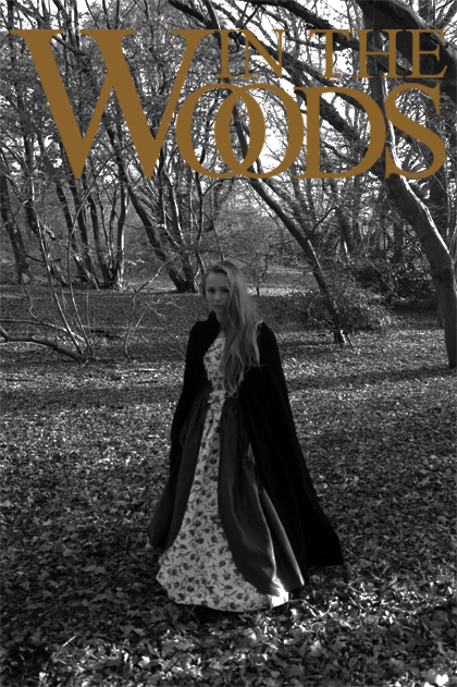
1) In accordance
with my thoughts on my concept, I began with the original image
placing the logo in the same place. I decided that the logo was in a
great place and that the images colours complimented the logo.
2) In fear that
the logo wasn't distinct enough from the background, I added this
brownish boarder to give the logo more texture and to make it more
visible by having more depth.
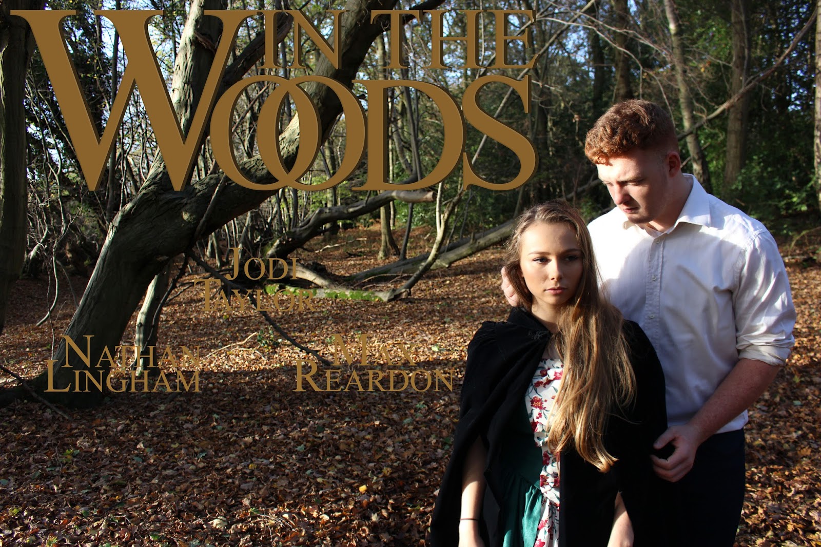
3) As I was
happy with the logo, I decided that the next step would be adding my
actors names. In order to be in-keeping with my logo, I thought that
the first letters of their names should be larger and more dominant
than the other letters. I also felt that I should try and arrange the
words together, like my logo, to show that the layout has been chosen
and is well thought out.
4) After leaving
the poster for a session or two, I realised that I didn't think the
layout of the actors names was as visually pleasing as it could be.
More importantly, my films protagonist (Jodi Taylor) was not the
first name – and it should be. Therefore, I moved Jodi's name to
the top of the triangle to make an implied sense of hierarchy.
5) It then
became obvious to me that the actors names were perhaps not readable
enough when placed ontop of the background. Therefore, I used
photoshops text feature to give the names more texture and depth, by
using the Texture and Contour tabs.
6) I found that
this made the words more complex which made the poster feel more
professional and conventional. However, this still wasn't enough to
make the words readable as I know realised that the bright background
was the real problem.
7) Therefore, I
cut-out my two actors with the lasso tool, to make sure they still
remained bright, added a black rectangle between the layers and used
the opacity tool to make it darker. Instantly, I felt the poster
looked more intricate and striking. Yet, I now felt that actually the
background could be darker and the actors names were still not right.
8) So, I made
the background even darker to give the poster a moody feel which,
overall, felt more dramatic. I also swapped over the lower two actors
names as I felt this was more aesthetically pleasing as 'Jodi Taylor'
seemed to fit perfectly in the gap, now. But I knew it still wasn't
right.
9) I realised
that the background was perhaps too dark and was compromising the
visibility of the actual background, so I put opacity in the middle
of the last two settings (this being about 60%). Because of this,
though, I now realised that my actors were not the right shade due to
a lot of white light so I used the 'Burn' tool to make their image
more yellow and vintage-y. I felt that this worked incredibly well
because it felt like, to me, the actors fitted more successfully into
their background. Also, whilst reconsidering my aim of minimalism, I
experimented with the idea of having smaller actor names – which I
felt worked because it made the poster feel more exclusive and
subtle. I also added in the small print at the bottom and I will
discuss these more in my next point.
10) After being
happy with everything else within my poster, I gave the small print
at the bottom some attention. I followed the usual layout to be
conventional, which involves making the names of people larger -
whilst keeping their titles smaller. As this is such a large poster
image, I realised that there was not enough credits to fill the whole
of the poster so I, instead, went for a smaller central alignment to
make the text on the poster seem spread out and seamless. I also
lowered in than in my earlier draft because I felt that lower down it
was less intrusive and demanding.