1. To
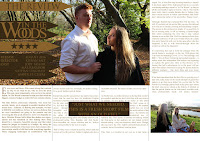
make sure that the proportions and alignment of my product were
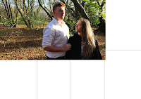
accurate, I used Photoshops ruler, rectangle and grid tools to give
myself a basic outline to the columns of piece for when I was
developing the text and images placement on my double page spread.
2.
Before discussing where I placed the image on the document, I should
outline why I decided on this image in general. This was one of my
favourite images and was a contender for the leading image of my
entire packet (my poster). Here are the main reasons I chose this for
the double page spread:
- The image has striking colours as a background.
- The clashing of the black and white outfits of the two actors cause drama and contrast of characters, causing intrigue for potential ticket-buyers.
- The pose of the actors is incredibly striking. By having Jodi look up at Max, there is a sense of power struggle and dependency which makes us, very simply, ask: why?
- The space to the left hand side, originally intended for the films logo, leaves perfect space to put text about for the films review and small print. This is important because I feel, as the image is strong enough, the text will not distract from the images dominance over the article.
I
placed the image where I did because many of the double page spreads
from film magazines I had looked at had the image larger than a
quarter and to the side – allowing a column of text on the other
side.
3.
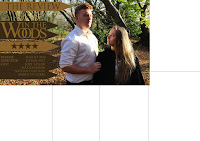
Brand synergy is, of course, very important. Therefore, I used
precisely the same typography as I did for my poster, logo and film
titles when developing my double page spread. As in recent years, the
films brand demands the house style of the double page spread. So, to
make it clear that this is from an external media outlet – I used
the title 'THE REVIEW' to indicate this. I made the containers of the
text, arrows instead of rectangles as it made the space feel more
intricate and thought-out.
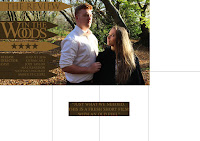
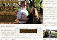
4. In
order to be in-keeping with convention and to make the layout of my
text more engaging to the reader, I set out my pull quote before
adding in the actual bulk of the article to ensure that the placement
of the pull quote was central and in a successful place.
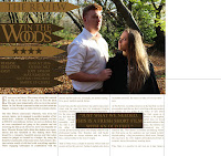
5. The
most important choice that I made in context to the arrangement of
the text of the article, was that I chose to make it fully-aligned.
Conventionally, most magazines are either left or rightly aligned
according to the image and layout of the entire article. I decided
that due to the traditional nature of my genre and the formality of
my branding, that this was more in-keeping and reinforcing of the
inherited, traditional nature of my product.
6. I
was in two minds about filling the entire right column with text as I
felt that it would look too affronting or full for the average reader
and I wouldn't want to scare of potential audience viewers just
because of extensive text. Therefore, I thought that placing an image
in the lower right-hand corner would solve this problem and make the
article feel more interactive. I chose this image as it included a
different character but mainly because the colours develop as the
image progresses (vertically) and does not steal the attention away
from the romance in the feature article photograph.
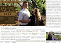
7. For
the final touches, I removed my identifying rectangles as a point of
reference. I also realized that, in order to make it clear of what
medium I was working in, that I should include page numbers and other
footnotes. In cohesion with my entire ancillary, I continued to the
same typography. I also made sure that the text was smaller than that
of the article text, so that it was the least of the readers worries
or distraction. I also removed the box that the pull quote was in to
make the bulk/body of the text feel more professional and subtle.
8. In retrospect, after viewing the document a week after completion, I realized that the text wasn't readable enough for my genre, form or demographic. So, in final stages, I changed the colour of the text to the darker brown, instead of the gold, that was already present.
8. In retrospect, after viewing the document a week after completion, I realized that the text wasn't readable enough for my genre, form or demographic. So, in final stages, I changed the colour of the text to the darker brown, instead of the gold, that was already present.

No comments:
Post a Comment