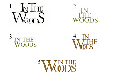
1) This was my first attempt at
my films logo. I am aware of the conventions of Period Drama logos, I was aware
the font that I used must be moderate and classical. Times New Roman is
certainly, in my opinion, a clear and concise choice. To start simply, I used
black and began to arrange the words. After some arranging, I thought it would
look most effective if I made certain letters bigger than others. The two O’s
crossing over was an accident to begin with however I quite like this and think
it may help me create a brandy and reinforce brand synergy.
Things that didn’t work in this
logo:
- The letters weren’t orderly enough and the logo looked too playful and my short film isn’t playful as it is a drama.
- The letters are not well aligned
- The letters are not centrally aligned
- Black is a flat colour
2) In order to improve, I focused
on the colours and alignment my second logo. As my film is set outside, I felt
green may be a good choice. I also tried not crossing over the O’s, to see how
it looked, and kept all the letters the same size to also experiment.
Things that didn’t work in this
logo:
- Not having larger capitalized letters
- The logo is too parallel and progresses too dramatically in size due to the different lengths of the words.
- Not having the O’s crossing has less character and although the period drama is about uniform logos, they still need to have something different and defining.
3) To address the issues raised
by the second logo, I arranged the first two woods to be above ‘WOODS’ and made
the ‘W’ slightly bigger than the rest of the logo.
Things that didn’t work in this
logo:
- The W still wasn’t big enough
- The colour isn’t opulent enough and feels slightly flat
- The letters still don’t align with one another
4) I chose gold as the leading
colour of the logo as it is dominant and slightly regal. Also, many Period
Dramas use golds and yellows as it is relevant to the time. In continuation
with the thoughts on the size of the ‘W’, I decided to make it almost double
the size of the other text. I also felt that the crossed over O’s are important
for brand identity and synergy therefore I decided to bring them back.
Things that didn’t work in this
logo:
- I liked the uniform nature of option 3 however it lacked character. This option, then, had too much character and wasn’t uniform enough due to the mish-mash layout of the words.
- ‘IN THE’ is too large in comparison to ‘OODS’ which isn’t good as the first two words have less importance.
5) To amend the earlier issues,
I:
- Resized the letters to make the word ‘Woods’ more dominant and eye catching.
- Aligned the letters to ensure they fitted into a slightly rectangular style which works well on the eye but also in terms of posters and double page spreads as it will fit into layouts well.
This is my final logo:
Brand Synergy:
In retrospective with all of the above, I have decided that my brand will be orientated around this typography and gold. This means that almost all text surrounding my film should be in this colour and close to this font. Also, the other colours surrounding my film should be browns and greens to evoke rural imagery and nature. In order to create a successful film and brand, I MUST stick to these rules and codes to have brand cohesion. 


